Vision: adaptation
Click here to go back to the Senses page
How to make the reversed image illusion
The tutorial below should show you how to create a reversed image pair from an original colour photograph. The descriptions assume that you're using Photoshop as you graphics tool, but most of the other packages (including free ones such as GIMP) carry out similar operations, and you can replicate the effects described below.
The information below can also be printed out in the following two-page PDF file.

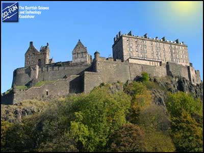
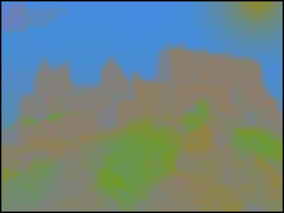
1) Select a photograph with lots of bright colours, especially greens and blues. Yellows are ok, but reds don’t reverse well, so the result will be a little disappointing in those cases. A beach shot – green trees, blue sea and sky, brown or yellow sand – works very well. In the example opposite, I added the SCI-FUN logo and also a somewhat artificial-looking sun. (Everything has to be hyper-bright and artificial-looking in the original image, as we’ll see.)
|
|
|
|
|
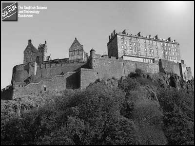
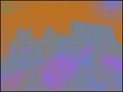
2) Duplicate the layer twice, and desaturate the lower one (i.e. leave the top layer as colour, and the background as the original). The image opposite shows the desaturated layer. You might want to experiment with different combinations of the red, green and blue channels (using the Channel Mixer), to get a nice, punchy contrast.
There’s also a tiny black dot in the centre of this image (not so obvious in this small version). This will be the point on the image that you should look (duplicated on the inverted version), to try to keep your eyes still during the experiment. |
|
|
|
| 3) Pick the top layer, and pump up the saturation/brightness, if necessary. (This works better with some colours than if you wait to do this after the inversion, below.) In the version here I cranked up the green foliage: this was something that became obvious after I saw the original inverted version, and increasing the saturation before inversion worked best here. It’ll vary according to your image. |
|
|
|
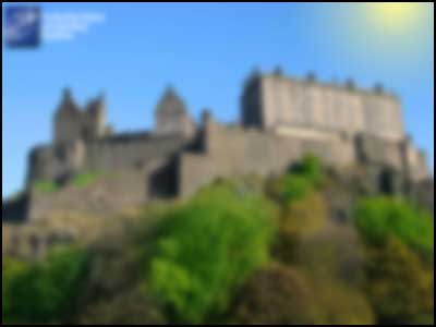
| 4) Blur the layer substantially. This helps to make it less clear what the viewer’s looking at when you show them the inverted version, and it doesn’t materially affect the illusion: human colour resolution is considerably poorer than our tonal discrimination, so when the inverted colour blur is superimposed onto the sharp, black-and-white image, we don’t see the blurring over the edge boundaries. |
|
|
|
| 5) Fill the layer with 50% grey, Luminosity mode, 100% opacity. All of the regions darker than or lighter than the 50% grey colour are brought to this level, so we’re left with a blurred image without any shadows or highlights: just the saturated colours. |
|
|
|
| 6) Then invert the image. Now we have an image whose colours are the inverse of the originals, and in places where the colours are not highly saturated in the original, we have faint, grey tones. In addition, we have no black or white contrasts. Having blurred the image makes it hard to see what this is (if we want to start off with this picture). |
|
|
|
|
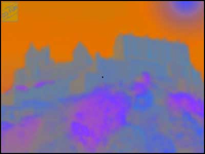
7) Tweak the saturation and brightness once more, with judicious masking. I pumped up the saturation for everything here (and it’s doubly saturated on the rock-face vegetation), so we end up with a fairly psychedelic picture.
Place a small black dot in the centre of the image (or where you want the person to look), and make sure it’s in the same position in both monochrome and inverted images. |
|
And that’s that. If you’re displaying the images on the web, arrange to have the roll-over state of the black-and-white version be the inverted, blurred copy, as was done on our website.
If you have a printer that’s able to print the bright, punchy colours that you see in the image above (rare in the cheaper printers, to be honest), you can make a nice greetings card. Stick the blurred image (with its central dot) to the outside of the card, and the black-and-white image on the inside, exactly underneath. When the recipient stares at the outside of the card, then carefully flips it open to see the black-and-white image, they should (for a few seconds) see a full-colour picture.
|