 |
|
Vision: colour-blindness
Click here to go back to the Senses page The retina of the human eye has three type of cone cells that respond to different ranges of colour (frequencies of light). It is from the signals generated by these cone cells (and the way in which those signals are combined and interpreted) that our sensation of colour is derived. Another set of cells in the retina – the rods – are adapted for dim light and night vision: because there is only one signal in this case, we see only a monochrome image. At the top of the diagram below we have four curves, each of which shows the sensitivity of a cone (colour) or rod (dashed) cell to the spectrum of colours found in white light. (This is a simplification: see our links on the Senses page for more information.) You can see that the three cone cells overlap in their range of sensitivity, but that each has a particular range over which it is most sensitive.
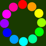
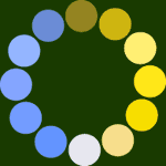
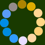
Beneath the top spectrum (which is what can be seen by someone with normal vision) there are three other spectra. These show you what is seen by people with three types of colour-blindness (out of many): in these cases when one type of cone cell is missing. The diagrams below are similar, but have circles of twelve distinct colours. On the left is the circle for normal vision. The next circle corresponds to what would be seen by someone whose retina was missing the long-wave (L, or "red") cone cells. As you can see, it's much harder to distinguish between some of the colours in the circle. (The other circles show what would be seen if the M ("green") or S ("blue") cones were missing.
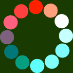
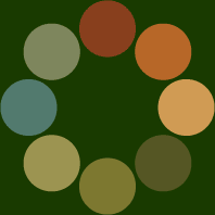
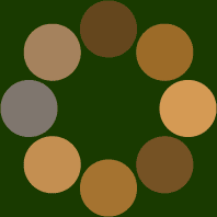
These aren't the only types of colour-blindness (indeed, the most common type is not shown here); in other cases the cone cells have a shifted range of sensitivities, which results in a similar pattern of altered (or reduced) colour vision. In very rare cases the cone cells are entirely absent, and only monochromatic vision is possible. The links at the bottom of the Senses page give much more information on colour-blindness, including websites where you can carry out a variety of tests. Testing for colour-blindness Full saturation colours (such as the spectrum above) are not usually where problems arise: it's subtle shades of colours (such as red and green) which are most often confused. To illustrate this, look at the circle of colours below-left. They're much less saturated than the pure spectral colours above, and are taken from the red and green parts of the spectrum. In the other two circles you can see how these colours would appear to someone with protanopia (missing the L cones) or deuteranopia (missing the M cones). As you can see, the colours in each case are now much more similar. [These colour sets were generated using the Vischeck program: see the links below for more information.] It's colours such as those on the left which are used to make colour-blindness test plates, as we'll see.
If we construct an image using the colours in the left-hand circle, we can test for both protanopia and deuteranopia. Making up your own images You'll need to have access to a program such as Photoshop, CorelDraw, PaintshopPro or GIMP (the last of which is free to download for Windows, although it's not as good at handling CMYK images without extra support). The eight colours in the wheel above must be accurately represented, for the best effect. The table below gives you the CMYK and RGB values which you need to set for each of the colours, starting at the top of the circle, and moving round in clockwise order. (The RGB colours are an approximation, and the variations in your monitor and printer make it likely that there will be lots of variation in the final output!)
We will shortly be posting a template file here, which lets you add your own colours to a series of splodges, to build up a test image.
Click here to go back to the Senses page |